Cheap and Littered with Design Errors, Meghan Markle's "Freakish Attention to Detail" Fails with Most As ever Products
RNN highlights a series of mistakes with As ever packaging and merchandise, which were all avoided with a proper

Meghan Markle’s series ‘With love, Meghan’ for Netflix, reveals a woman with an obsession with making everything looking perfect. From putting pretzels from one bag into another to writing out a brunch menu in fancy cursive for a casual gathering of friends and family, Meghan always strives for her definition of perfection. But does her ‘As ever’ products live up to her claim that she has a “freakish attention to detail”?
The answer is a simple no.
From cheap stickers that are bubbling up and crooked to obvious graphic design with font and copy fails that would have been easily caught by any competent copy editor, As ever screams cheap more than it does elegance.
While it’s understandable that products, especially initial lines from a start up, can have issues, what I’ve been seeing with my As ever haul reveals something much deeper.
She claims that her brand is “joy” and that she wants to “elevate” the every day, but what I see instead is someone who strives for perfection for herself while giving paying customers a subpar products and packaging. So Meghan can fake being a copyeditor all she wants and a female founder who is obsessed over packaging, but, as a consumer, it seems clear to me that she couldn’t care less about those spending their money to support her “business.” She is more than willing to cut corners if it financially benefits her with little care of the final product.
As someone who worked in copyediting, graphic design and comms for years, these mistakes are so obvious and avoidable, that it really does boggle the mind. With a partner like Netflix, it’s surprising that they would approve offerings this poorly produced. So without further ado, here’s a breakdown of all the design issues I’ve found in Meghan’s As ever products.
(If you would like a review of the actual products, like the teas, spread and mixes, you can find that on YouTube here.)
Microscopic Size
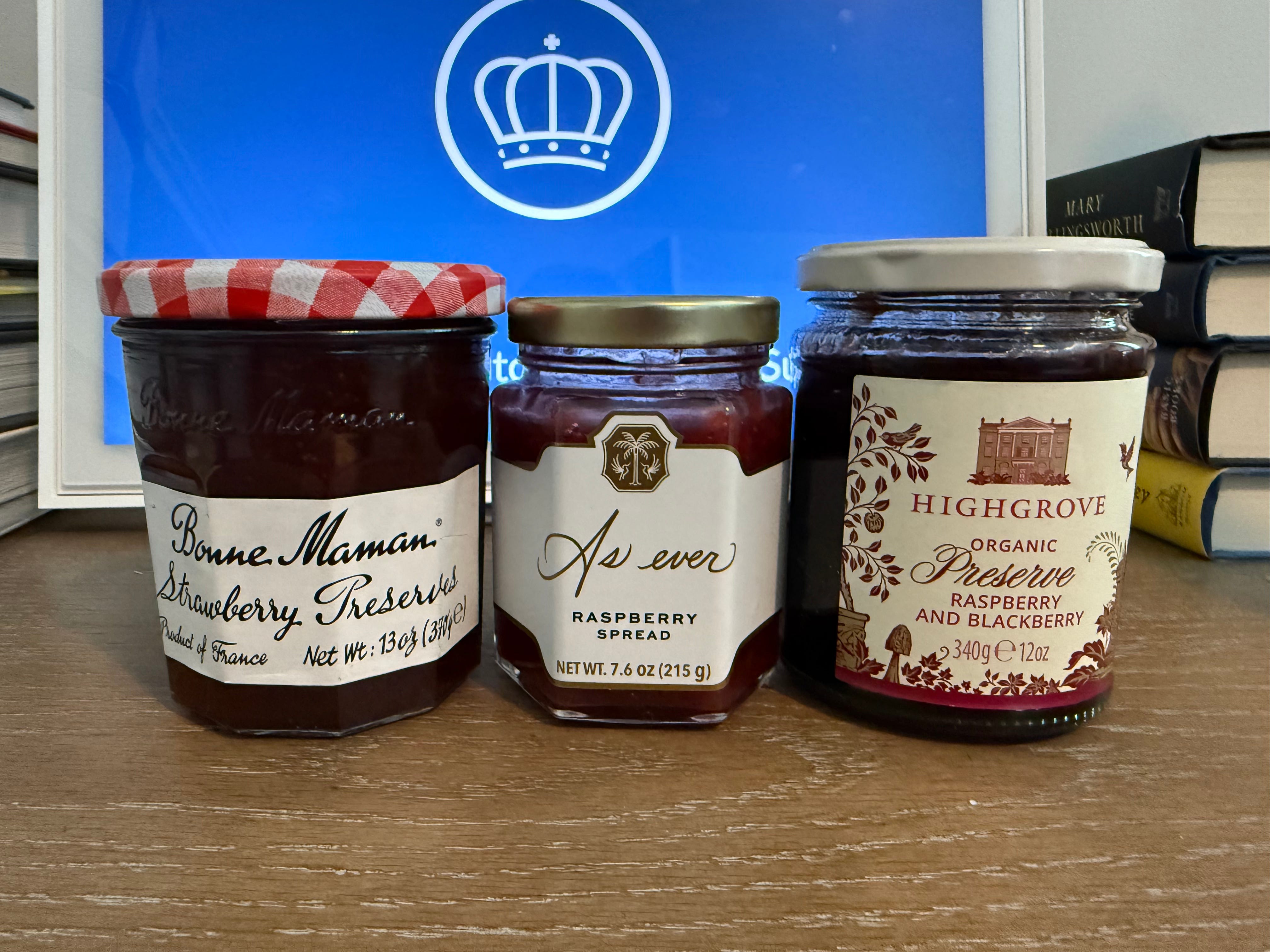
The Raspberry Spread, which Meghan inexplicably believes is her signature product, is microscopic in size to say the least compared to its lower or similarly priced competitors. Sitting at a diminutive 7.6oz, it seems tiny compared to the 12oz Highgrove preserves and 13oz Bonne Maman preserves. Given that there is nothing noteworthy about Meghan’s Raspberry Spread, the absurdly small size seems like a bit of a cop out. Now, the preserves sold by The Royal Collection Trust are a bit smaller and are about the same price, but they are also there to support the preservation of the artifacts and the Palaces of Buckingham, Holyroodhouse and Windsor Castle. When it comes to charity and supporting restoration work so all can enjoy, people are more than willing to buy something at a premium, whereas Meghan product’s exists simply to fill her own pockets.
Crooked Stickers
This might not seem like a big issue, but for me it actually makes her products look rather cheap, and that’s a crooked sticker. This really only appeared on the Hibiscus Tea, but it remains notable all the same. Once you see it, you can’t unsee it (and it’s even more apparent in person).


Bubbling Stickers
In addition to a crooked sticker, some of the stickers were also bubbling. Again, this happens but it makes the products look rather cheap, despite her selling them for $12 a pop. In comparison, King Charles’ Highgrove brand printed directly on the tin at also about $12, which makes it look more expensive and thoughtful (you also get three more tea packets compared to As ever). For Meghan, it appears that she purchased some sort of mass produced tin and stuck a sticker on it.


Copy Spacing Issue
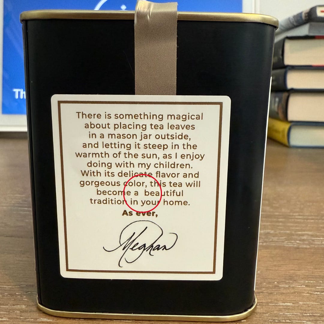
One of the core roles of a copyeditor is to make sure that the spacing is correct. This requires endless, and I mean endless, reviews to make sure that nothing falls through the tracks. Of course Meghan made mistakes. For the Hibiscus Tea, she has an additional space between “a” and “beautiful” towards the end of the copy. It was something that stuck out immediately after reading it.
Graphic Design Fault with Spacing
One of the key aspects of making sure a product looks good is avoiding negative space. When you’re working in something like Adobe InDesign, a graphic designer or the writer can create margins that ensures the copy looks uniform. For example, that each line of text goes to the end of the appropriate text box or that the copy is adjusted so the text box has equal wording on each side.
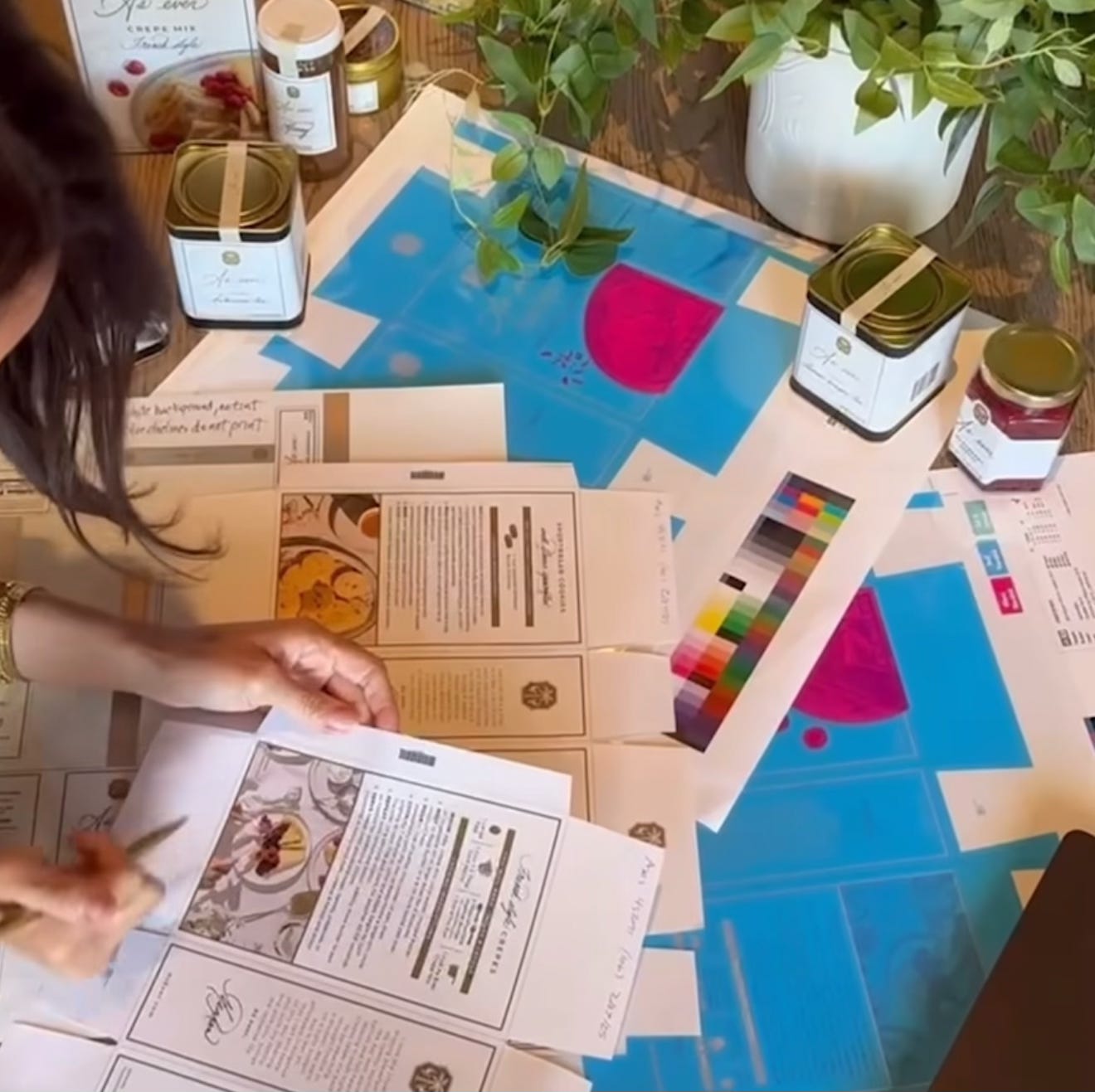
This did not happen with the French Style Crepe Mix sold by Meghan Markle. Despite her doing an obvious fake copyedit session with the mix box on Instagram, she missed a pretty obvious design issue. I’ve highlighted the negative space in the copy below (and you can see the same issue in the copy she’s looking at as well). There were obviously two different text boxes, as the lines of text are not remotely uniform about halfway down.
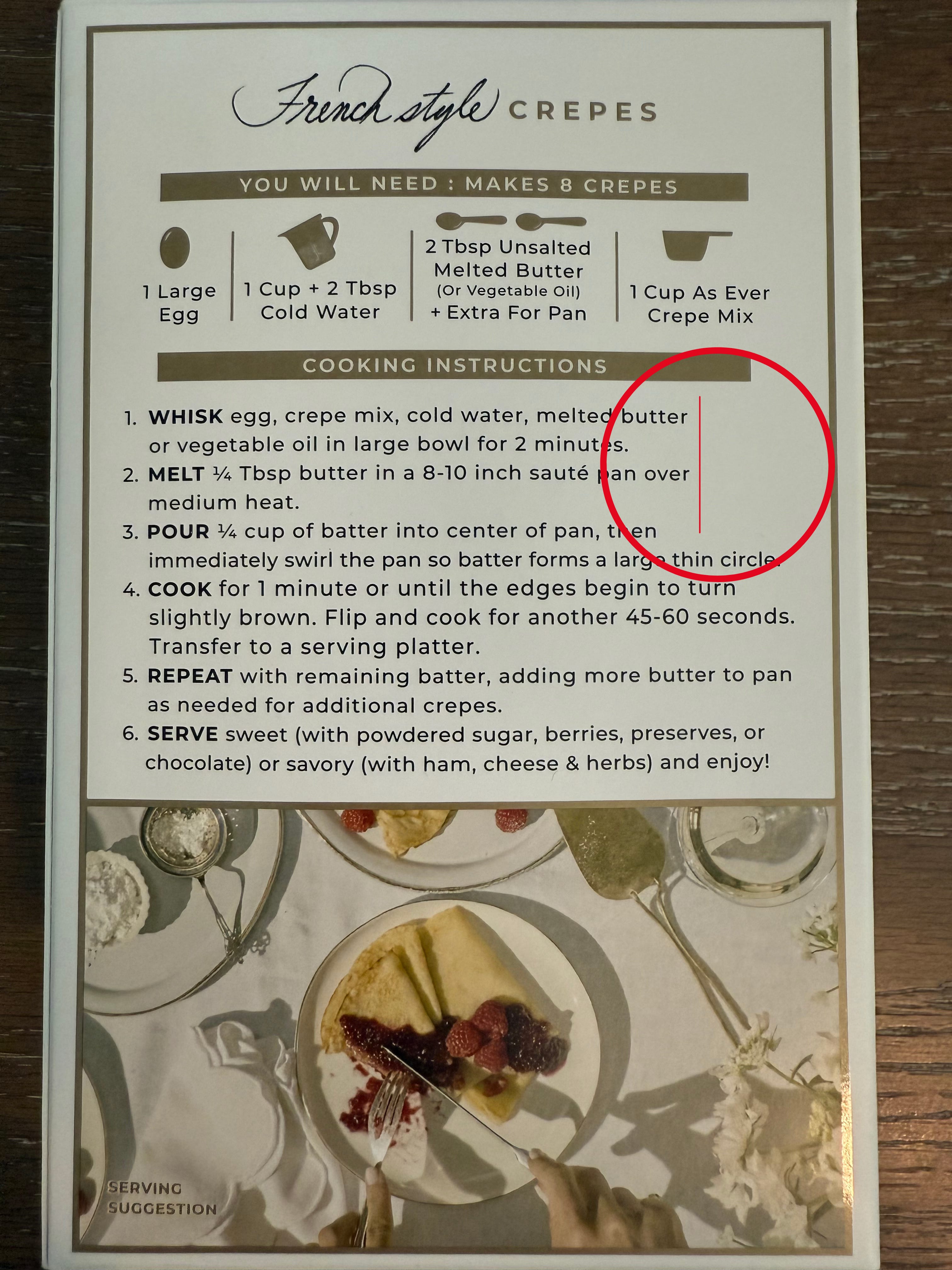
I’ve tried to highlight the margin line as well to show how the text box in Adobe was probably too short at the top and wasn’t adjusted for the rest of the copy. AND…
Inconsistent Fonts
When looking at the picture above, something else just suddenly jumped out at me.
The font is not consistent. The font for the fourth direction is a slightly bigger than the other lines. Again, this is an obvious mistake that would have been caught with a competent copyeditor. But if Meghan was doing that, then obviously her “freakish attention to detail” obviously doesn’t extend to font sizes.
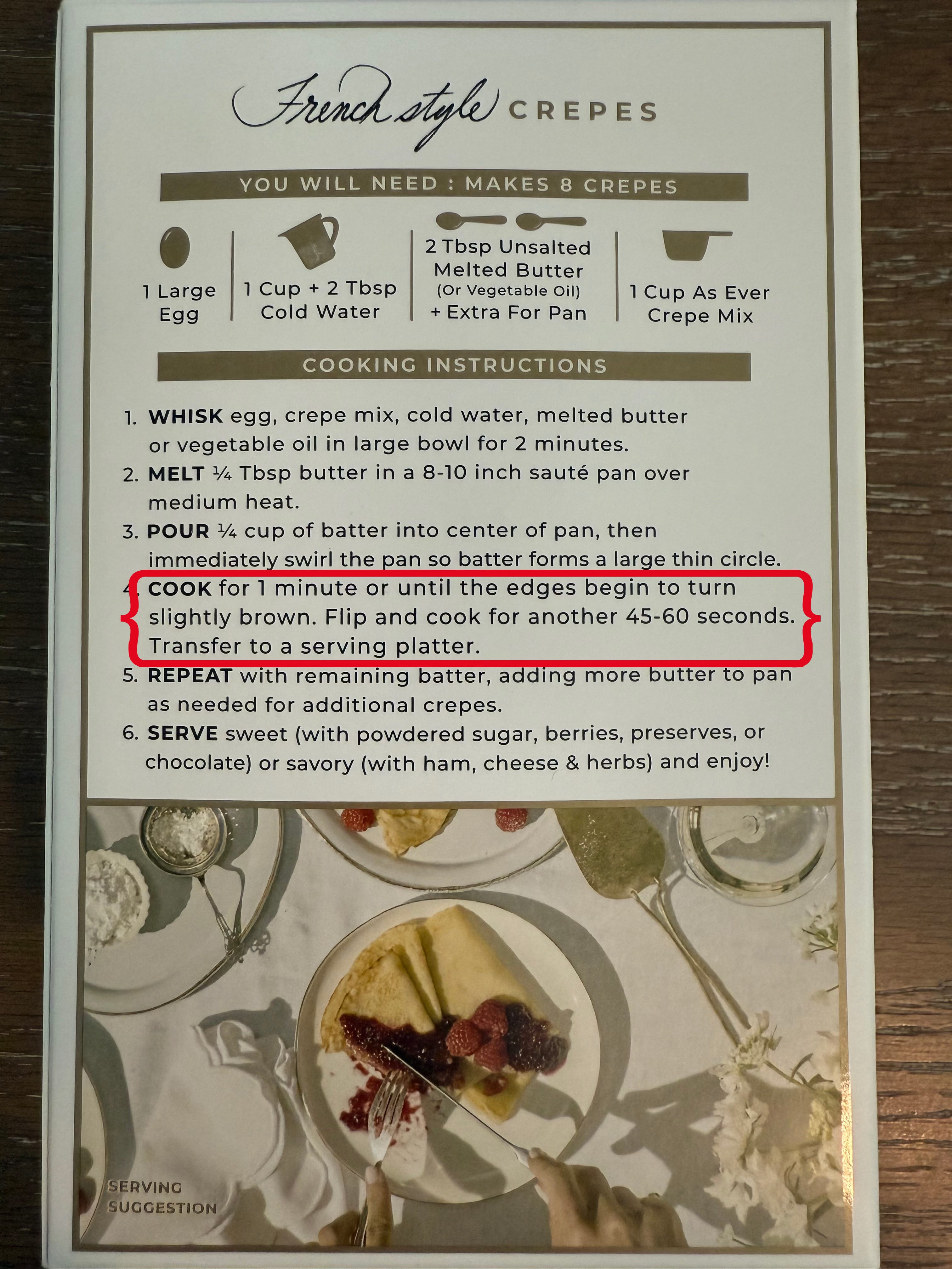
Copy Issues
Meghan is not the writer that she thinks she is, and there’s some obvious copy errors that should have been corrected before these products went to print.
On the French Style Crepes, she writes for the second direction (you can look at the picture above), “Melt 1/4 Tbsp butter”. I believe it should be “Melt 1/4 Tbsp of butter.” Now, I could imagine that the “of” isn’t necessary, but she uses “Pour 1/4 cup of batter” a line below, so this seems to be a mistake or at the very least an editorial inconsistency. Again, for a brand Meghan should have a consistent editorial standard, like I do for this channel.
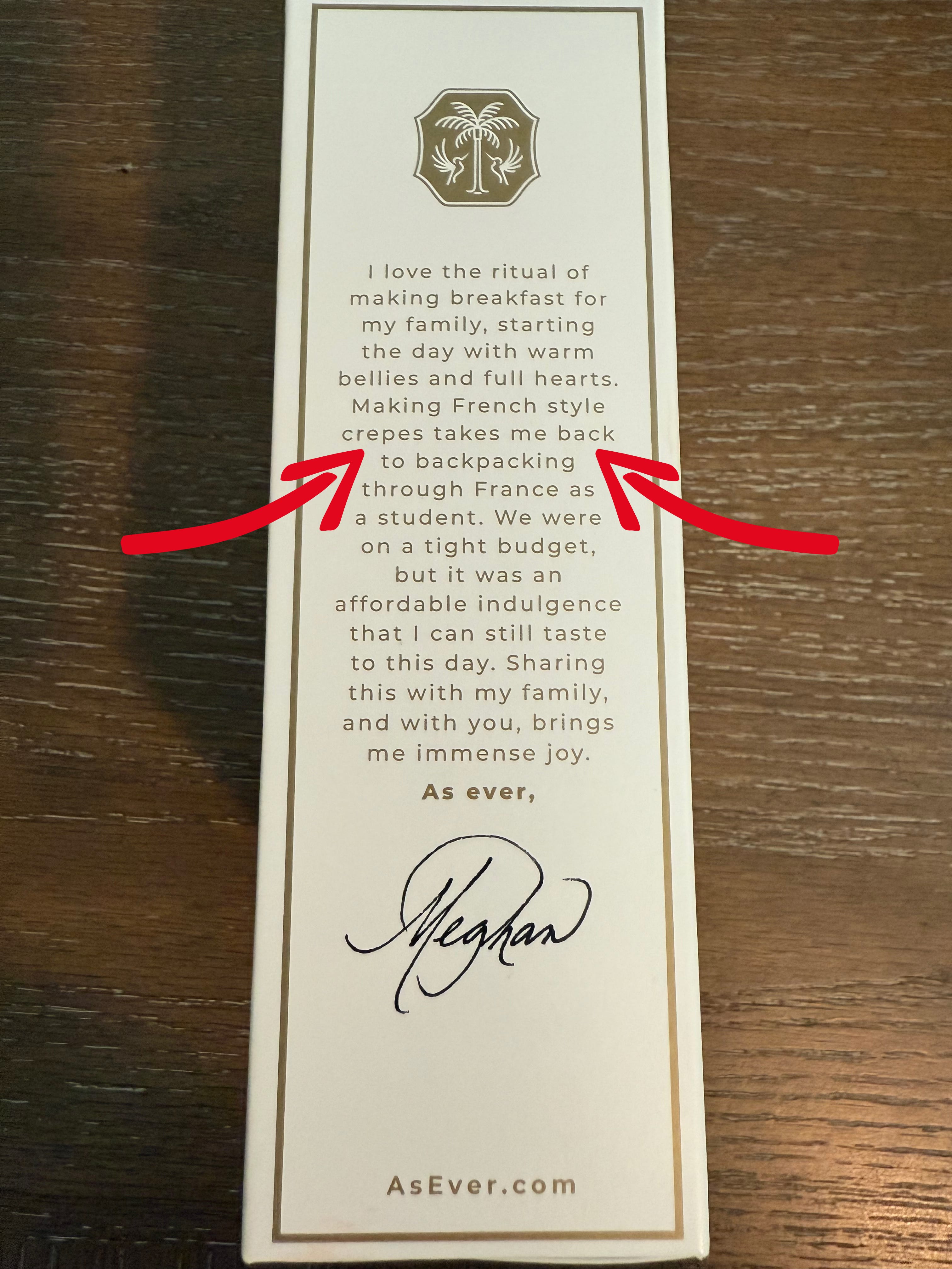
She also makes another boo-boo on the copy of the Crepes with this line: “Making French style crepes takes me back to backpacking through France as a student.” For those unfamiliar, it’s best not to have “back” and “backpacking” too close together. It’s always better to change up the copy to make it more interesting and have fewer redundancies in the word use. If I was her editor, I would adjust it to “Making French style crepes reminds me of backpacking through France as a student.” Again, it’s perhaps not strictly necessary, but it’s simply better.
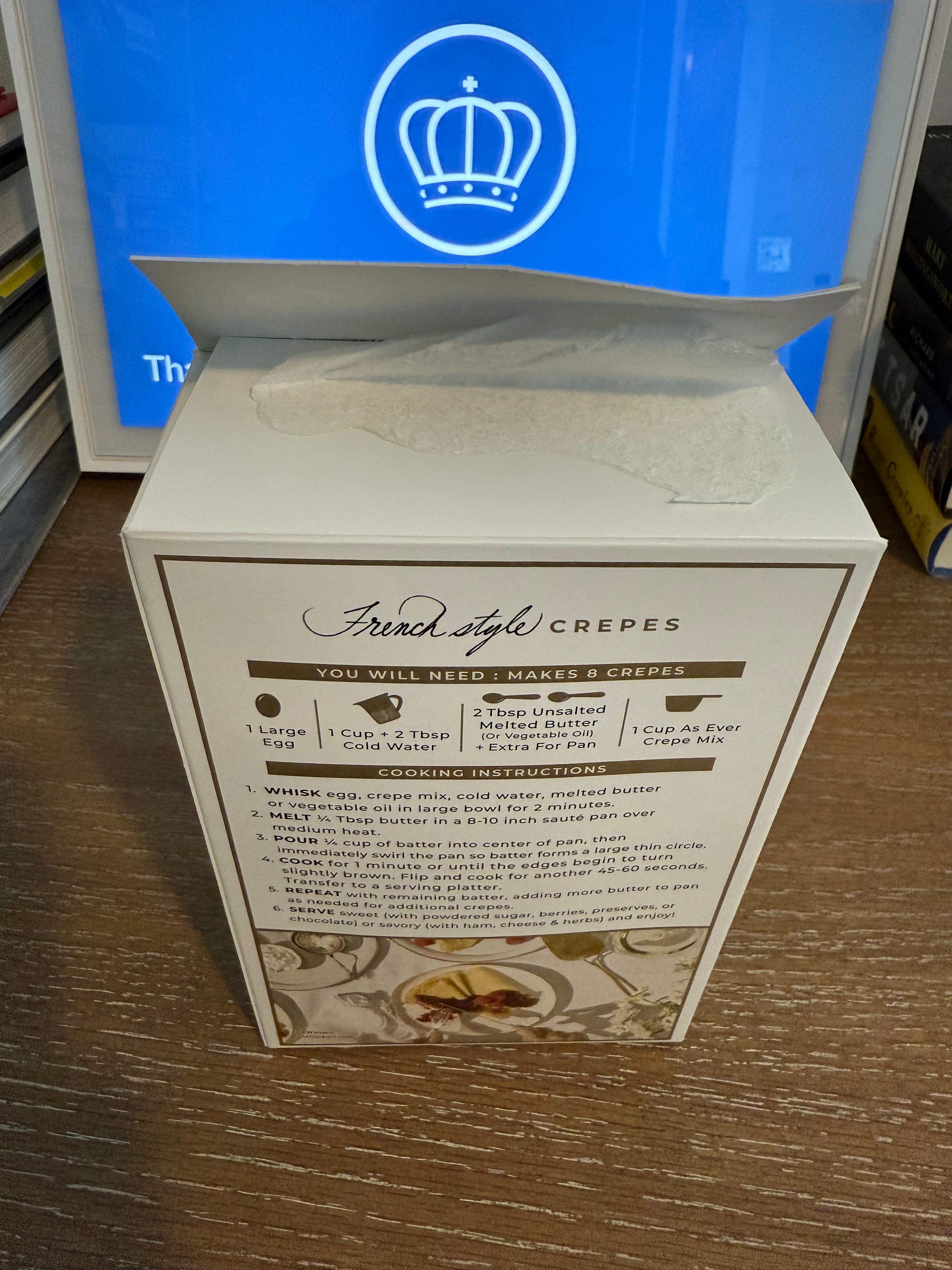
Cheap Boxes for Cake Mixes
One of the things that’s irritated me most about Meghan Markle’s crepe and shortbread mixes is the box. Believe it or not, after you open the box, there is no ability to sort of re-close the top like you can with many other boxed products. That could have worked if both boxes were one and done mixes, but the crepes are not. This means that after you open the box, to get it to close you have to tape it. Even the cheap $4.00 mixes in the grocery store have a way of closing the top after opening. To me, this seems like another example of cheap packaging.
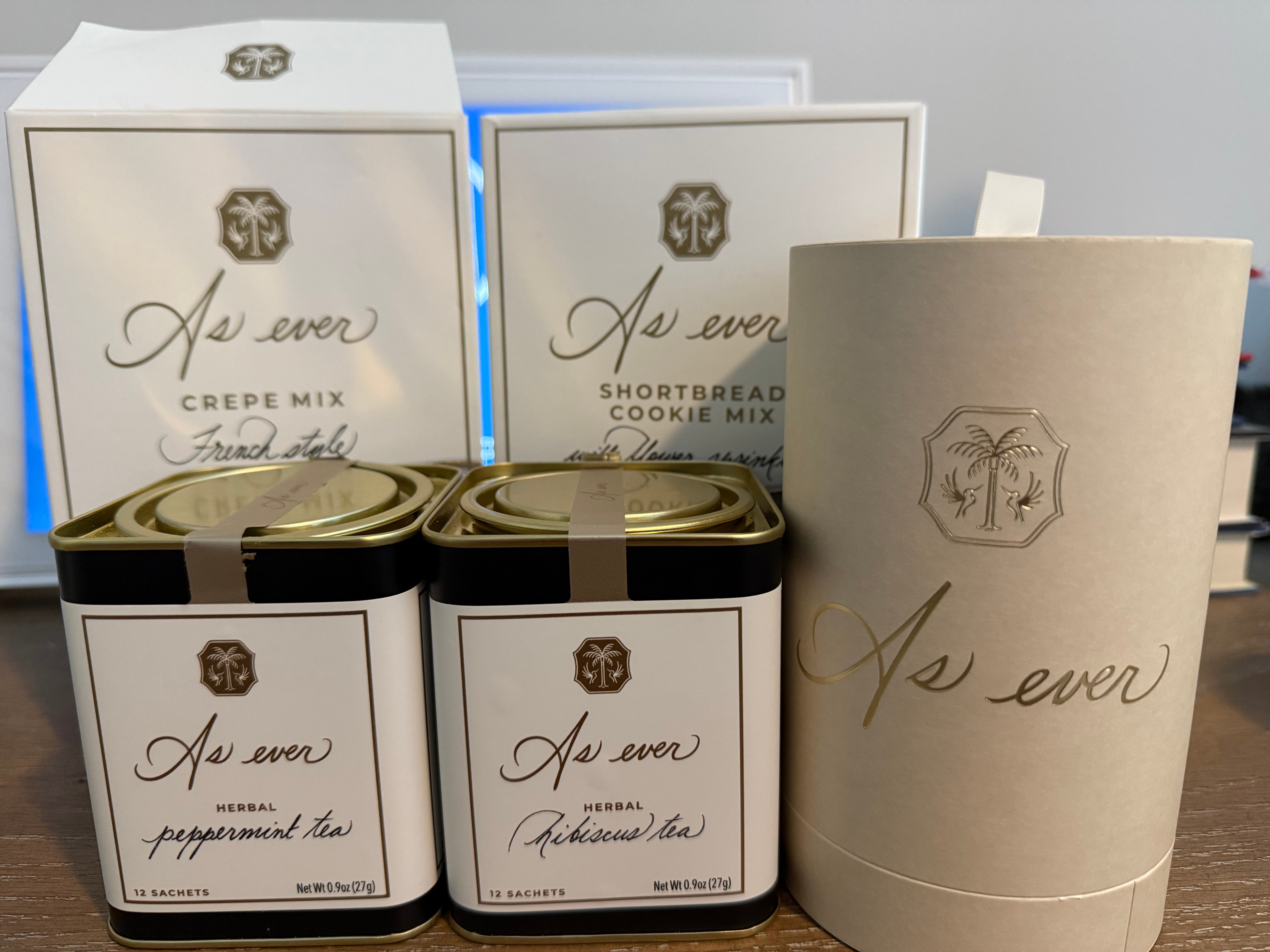
Packaging Lacks Consistency
Meghan’s packaging for As ever is inconsistent, and shows a lack of vision for the brand. The keepsake packaging for the spread doesn’t match the mixes or the tea. I would argue the tea is the most inconsistent with its black background, when the colors from the brand are obviously white and gold. Then the keepsake packaging is a beige color that is not pulled through with any other product. This wild inconsistency again shows a brand that lacks cohesion, as none of the products appear to really go together.
Keepsake Packaging is Pointless
The so-called “keepsake” raspberry spread was not only forced on consumers, as you couldn’t buy the spread without it, but it was also entirely pointless. Meghan’s suggestion of “love letters” is ridiculous as to make it work the keepsake would have to be turned upside down as the bottom was too shallow to actually hold a letter at all. (Also, I imagine that keeping pens in Meghan’s spread jar is also difficult to imagine as it’s probably too short to do that too.)


Some will perhaps just believe that I’m quibbling over small details, but these are mistakes that should not be happening. Meghan is selling products that are by-in-large merely middling in their taste and presentation. She could, perhaps, get away with her mediocre offerings if her actual packaging and branding offered a feeling of elegance and elevation.
The reality is, As ever is merely a badly executed brand on nearly every level.
From obvious grammatical and copy errors to low quality packaging, it all comes across as incredibly cheap. There is no way as an average consumer I would ever purchase her products again as the quality, for the price, just isn’t there. I would be immensely curious if her “friends”, celebrities and preferred journalists got something different, or the same slop the general public did. Because to pay a premium for such obviously poorly constructed, conceived, edited and executed items is ridiculous.
As a result, I don’t see this brand having longevity. Meghan can perhaps turn things around by actually putting the appropriate time, energy and effort into this idea, but I doubt it. Meghan appears to only care about getting her name in the headlines and cash in her pockets. When she gets bored with this, she will move onto something else. She doesn’t appear to take much interest in any of this anyways, so I’m sure she would be happy to move on.
Despite her claims of having a “freakish attention to detail” Meghan Markle’s brand As ever fails at nearly every level.
By and large, not by in large. 🙂
for a post demanding perfection from others,i see a lot of errors